Using Science Journal to do some basic physics
The following is a quick write up showing just one of many possible labs/mini-projects that one could do using the built-in sensors on a normal smart phone. We'll use Google Arduino Science Journal to record the accelerometer values for a cart rolling down a ramp and then excel to plot and analyse the data.1
Basic Setup

To start, you'll need a little toy car, a modern smart phone, and a ramp. Here is the ramp. (It's just a book and some blocks) Open up the science journal app, and crate a new measurement and select the appropriate accelerometer. A normal phone will have 3, one for each axis. Depending on how you set up the experiment, you'll want to pick the appropriate direction to measure. Take some time to play around with the app and investigate the different accelerometer choices. I chose the X direction to measure for this quick demonstration.
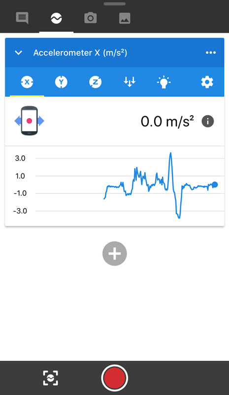
Now you should be able to get to screen that looks like this image. You'll see the live graph of the accelerometer measurement. One thing you'll note is that just by rotating the phone, the value will change. This is expected, and we'll deal with this later on in the data section.
The Measurement
Next, affix your phone to the car somehow (i.e. tape?). Press the record button, wait a few seconds, then let your car+phone roll down the ramp.
You should now be able to see your measurement data on the phone. Depending on your OS, there will be different ways to export it, but the basic idea is to now export it as a csv file that we can play with in something like Excel (or another, better application if you choose). Instructions are here. Make sure to choose 'relative time' when you get to the export step since this will make the first measurement occur at t = 0.
The Data
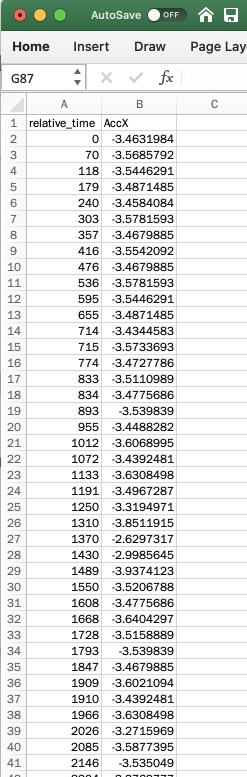
When you first open up the csv file in excel, you should see something like this. You'll see a column with time (in milliseconds), and the raw output of the accelerometer sensor at each moment in time.
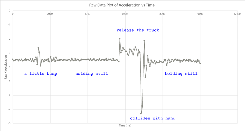
Clearly, something isn't quite right, since for the first 5 seconds or so, the graph shows an acceleration of about -3.5 m/s2, even though the car was stationary the whole time. This is due to the angle of the phone with respect to the ground. So, we need to get rid of this offset. To do so, simply find the average value during the time when it is stationary, like from 2 seconds to 5 seconds, using the AVERAGE() function built into Excel. For this particular measurement, we see that value is about -3.498 m/s2
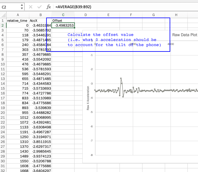
After you have this 'offset' value, go ahead and subtract it from each of the measurement cells, as shown below.
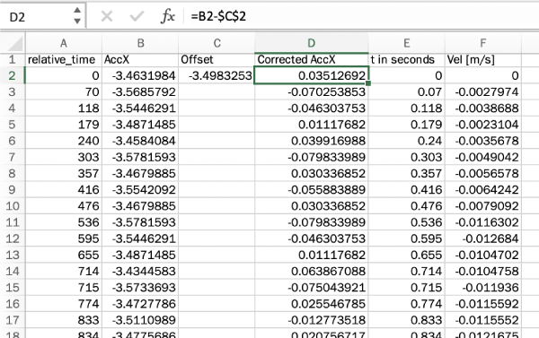
And, while, you're at it, go ahead and make a new column for the time which will be measured in seconds, rather than milliseconds, so our units are SI.
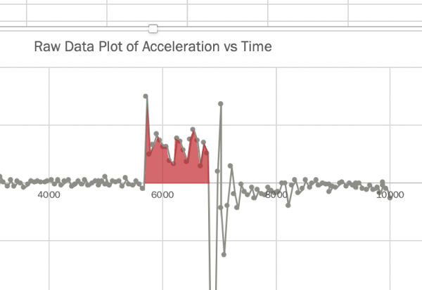
You be able to look at the graph of your data now, and see a fairly clear and obvious region of time where the acceleration is different (and constant). This is the region where the cart is accelerating down the ramp.
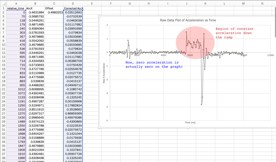
Fantastic. Now we have a real bit of physics to work with.
The last thing we'll do in this demo is to use the acceleration to calculate the velocity.
Using basic kinematics, we know that the definition of acceleration is just the change in velocity with respect to time: $$a(t) = \frac{\Delta v}{\Delta t}$$ If we consider the limit as $\Delta v \rightarrow 0$, then we have the derivative version of this definition: $$a(t) = \frac{d v}{d t}$$, which using a little calculus can be rearranged as: $$v(t) = \int a(t) dt$$
The integral of the acceleration vs time graph between two points in time, is therefore just the velocity (plus the integration constant). So, looking at our rough graph, we can see the region we would like to integrate. Unfortunately, it's not a nice function, like $a(t) = 3t^2$, so we can't do an analytical integration. Instead, we'll have to add up all the areas under the curve manually. Well, not that manually actually, because that's something excel can do for us.
We'll use a simple midpoint Riemann Sum method to add up all this little bits under that graph. More about these techniques can be found here: Riemann Sums.
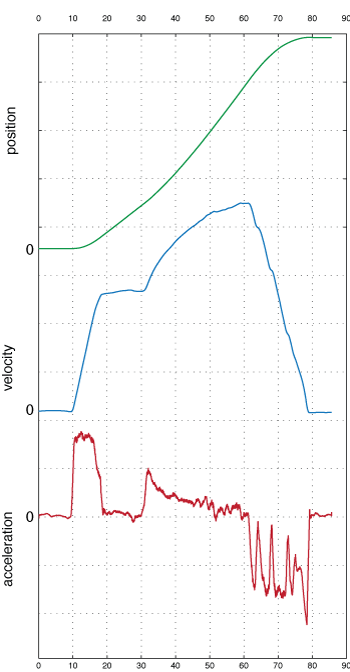
After a little excel work we get a new column of the velocity at each moment in time. If we plot that, and compare to the acceleration graph, we finally get something that begins to make a lot of sense.

During the region with constant acceleration, the velocity begins to grow linearly! When the cart hits my hand at the end, there is an abrupt slow down. Here is a spreadsheet with all the data and calculations to get you started with performing your own 1-d kinematics measurements.
What else can we do?
There are of course many more things one could do from this starting point. Some possible extensions include:
- Finding $x(t)$ in the same way using the $v(t)$ data points.
- Confirming that the angle of the ramp, $\theta$ makes sense with the observed acceleration (since $a = g \sin \theta$ for objects on ramps.)
- Measuring more exotic motions and seeing what comes up.
Here's an example of a measurement from a subway trip. You can see the positive acceleration that corresponds to the train leaving the station, another acceleration about 30 seconds, and then a negative acceleration (i.e. hit the brakes) as the train approaches the next station.
1. Since writing, the Science Journal App has changed hands from Google to the beautiful people at Arduino. Same app more or less, different colors.